Logo Design
Graphic Design
Print Design
Branding

 Shopify
 Shopware Software Development
 Typo3 Web Development
 WooCommerce
 WordPress
 Google Ads Performance Marketing
 SEO Social Media Marketing Video ProductionShopify Development Companies Shopware Development Companies Software Development Companies TYPO3 Development Companies Web Development Companies WooCommerce Development Companies WordPress Development Companies
 .NET Development Companies
 Angular Development Companies AR / VR Development Companies Blockchain Development Companies DAM Development Companies
 Drupal Development Companies IoT Development Companies
 Java Development Companies
 Joomla Development Companies
 Laravel Development Companies Machine Learning Development Companies
 Magento Development Companies
 PHP Development Companies Progressive Web App Developers
 Python Development Companies
 React Development Companies
 Ruby on Rails Development Companies
 SAP CX Development Companies
 Sharepoint Development Companies
 Vue.js Development Companies
 Webflow Development CompaniesGoogle Ads Agencies Performance Marketing Agencies SEO Agencies Social Media Marketing Agencies Video Production Companies Affiliate Marketing Agencies Conversion Rate Optimization Agencies Direct Marketing Agencies Email Marketing Agencies Event Marketing Agencies
 GEA Agencies GEO Agencies Inbound Marketing Agencies Instagram Marketing Agencies Lead Generation Agencies LinkedIn Marketing Agencies Market Research Companies Media Buying & Planning Companies Naming Agencies PPC Agencies PR Agencies SEM Agencies TikTok Marketing Agencies YouTube Marketing Agencies


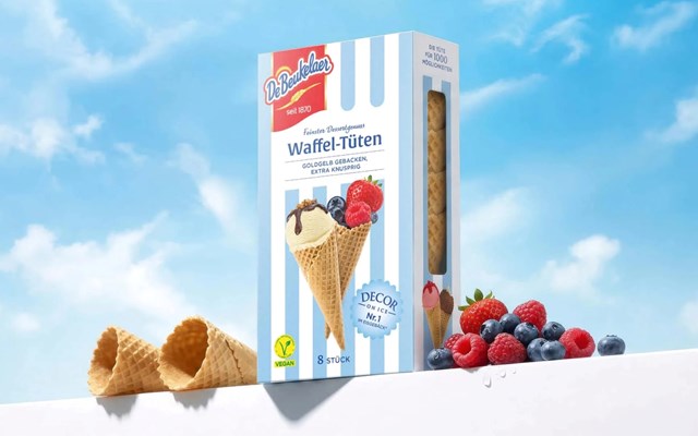
With Decor On Ice, DeBeukelaer brought a classic dessert back to life. At the heart of the project was a packaging redesign that makes the brand’s traditional waffle cups feel more modern, premium, and emotionally resonant. The goal was to preserve the familiar quality of the brand while creating a fresh look that stands out on the shelf and sparks cravings for creative dessert moments.
A distinctive stripe look in pastel blue and white was developed, giving the packaging a lighter feel, more dynamism, and stronger visibility from a distance. The new design brings to mind summer days, ice-cream parlors, beach umbrellas, and bath towels—translating the dessert moment into a positive, emotional visual world. The red DeBeukelaer logo has been placed much more prominently, helping firmly position the product within the premium brand segment. A clean white assortment area and modern typography create a sense of calm, clarity, and quick orientation. The refreshed look is completed by an appetizing visual style featuring crisp waffle textures, chocolate, ice cream, berries, and topping inspiration. In addition, the side flaps communicate different ways to enjoy the product—from classic enjoyment with ice cream to fruity fillings, all the way to a more grown-up premium moment with liqueur. This way, the product isn’t just presented as a waffle cup, but as a versatile stage for creative dessert ideas.
The new packaging design significantly boosts the visibility of DeBeukelaer Decor On Ice. The bold stripe look grabs attention on the shelf and helps you experience the brand across multiple packs as a cohesive, harmonious brand block. At the same time, the more prominent brand placement increases recognition and reinforces a more premium perception. The new look blends tradition with a modern, indulgent presentation and appeals to both longtime brand enthusiasts and younger, impulse-driven shoppers. Thanks to a flexible design DNA, it also lays a strong foundation for future line extensions and innovative product concepts. With this update, Decor On Ice evolves from a classic dessert into an inspiring platform for creative moments of enjoyment.
Contact the service provider and receive an appropriate offer in a timely manner.